ASTER, MOPITT, and CERES
Contents
We continue our familiarization with Terra instruments, looking at ASTER, MOPITT, and CERES.
ASTER, MOPITT, and CERES
ASTER produces images over a range of wavelengths. The first we look at is a black and white view covering part of the Visible-Near IR spectrum which depicts a segment of the San Francisco River in Brazil. Note its similarity to Landsat images but at 15-m resolution

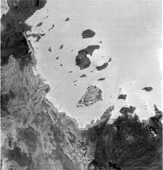
Look next at an ASTER thermal IR image taken at night, showing (in light tones signifying warmer temperatures) the Red Sea and a small land area (dark; cooler) in Eritrea in eastern Africa. This is similar to HCMM images examined on page 9-8 but the image area is just 60 x 60 km and the ground resolution is 90 meters.
ASTER contains enough wavebands to choose several to make false color composites that appear almost identical to those characteristc of both early and later Landsats. Here is Calcutta, India produced in this mode:

The fourth image is also a false color composite made from three of the Visible-Near IR bands merged wth the higher resolution panchromatic camera image.. The 15-meter resolution is capable of picking out many of the larger buildings in Reno, Nevada.

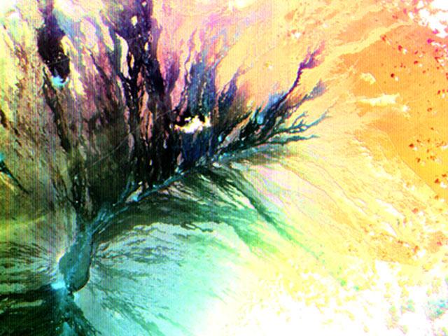
Since ASTER has channels (bands) in both the Visible and Near Infrared (also designated SWIR for Short Wave Infrared), it can produce color composites from both reflected and thermal multispectral radiation. Look first at this image showing the summit and eastern flank of the huge Mauna Loa volcano on the Big Island of Hawaii. This false color composite singles out a dark black (recent) lava flow emanating from a fissure that sends tongues out against an older, more weathered lava surface.
The companion ASTER scene is a multispectral thermal image made from bands at 10, 12, and 14 µm (rendered in blue, green, and red respectively). Note the resemblance to images produced by the TIMS airborne system (page 9-7). The sharp contrast of the black flow, seen above, with neighboring lava is now obscured as the two areas are more uniformly purple, indicating a similarity of composition. The aqua areas beyond are previous (older) flows.
thermal bands combined into a color image.|
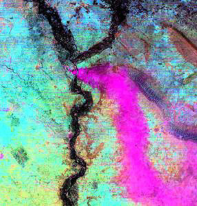
The ASTER thermal bands can actually indicate something of the chemical composition of materials, including gases. A fire near Mosul in the postwar period in Iraq produced smoke that was enriched in noxious SO2. This takes on a distinctive color (pinkish-purple) in the false color composite shown here:
The next three ASTER images display the now familiar San Francisco Bay area. The top image is made from SWIR bands. The middle images is a composite using thermal data with visible bands: the warmest temperatures (red and straw yellow) are found in San Francisco and across the Bay in the Oakland group of cities (more industry). The bottom image blacks out the land and uses thermal data to depict temperature variations in the water, with the usual convention of reds being warmest and blue coolest.
bands on Aster.|
visible band to make color composite in which reds indicate warmer areas.|
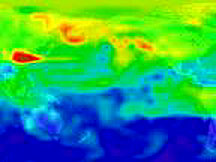
MOPITT’s prime task is to measure concentrations of CO (carbon monoxide and CH4 in a vertical column through the atmosphere. The image below shows radiance variations measured by Channel 1 within a series of strips covering part of the Earth’s globe but the black areas represent regions still to be traversed. Reds and yellows are high and blues low quantities of radiance.
in strips representing orbital path coverage (incomplete) for the Earth; carbon monoxide (CO) variations can be derived from MOPITT band data.|
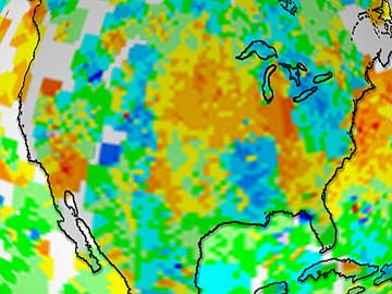
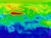
Carbon Monoxide (CO) values are derived from radiance differences with measurements taken at different times by the several channels in this instrument; other ancillary data are then added to determine amounts. The amount of variations can then be converted into maps by assigning colors to the determined ranges. In the next image, the data show CO distribution over large regions of North America; yellows and browns are higher and greens and blues lower CO readings.
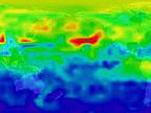
A different rendition indicates variations in CO along strips that pass over southern Asia and India:
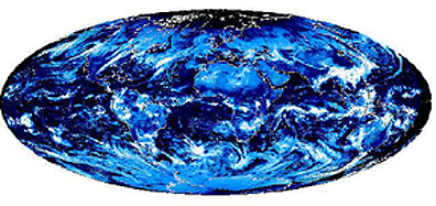
And, over time the CO measurements allow plots of variations over the entire globe, as indicated in this hemispherical map.
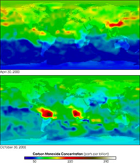
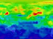
Global studies of CO distribution are leading to a better understanding of why certain areas show higher concentrations. The next two maps taken at different times in the year 2000 show the influence of burning forests and grasslands (especially in the lower image where the orange colors are found mainly in the Amazon and the tropical forests of west central Africa).
MOPITT can follow over short time spans specific plumes of CO gas that exhibits notably high concentrations. In the sequence below, an elongated plume begins off the coast of Asia and moves across the Pacific, reaching the west coast of North America. The dates of observation are: Upper left = March 10, 2000; Upper right = March 12, 2000; Lower left = March 13, 2000; Lower right = March 15, 2000.
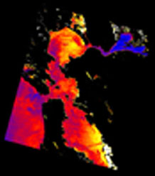
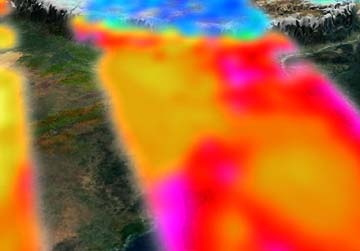
CERES measures both reflected and emitted radiation attributed to the Sun’s irradiance. The image below is a map of emitted radiation from the surface and atmosphere, caused by solar heating, for the United States in early April. Reds and yellows are warm; blues and grays cool.
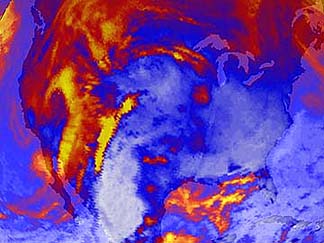
Part of the eastern hemisphere of Earth is shown in this later summer CERES map. The blue areas are primarily caused by large cloud banks, whose temperatures register as cool relative to the much warmer land surfaces.
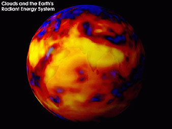
The final pair of images in this initial data set from Terra’s first days of measurements shows, on top, a global map of reflected solar radiation at the top of the atmosphere as sensed by the CERES instrument for a 24-hour period and on the bottom emitted thermal radiation from both the atmosphere and land surfaces (with color assignments of red/yellow to warm and green/blue to cooler).
due almost entirely to solar heating, as measured by CERES.|
As more data are acquired and delivered to the many groups participating in the Terra phase of EOS, new images and data interpretations will be forthcoming. For those accessing the Tutorial through the Internet, from time to time look for one or more new pages in this Section that will update the assessment and implications of this means of providing coherent data suited to demonstrating how satellites contribute to understanding our global environments through the Earth Systems approach. And watch for the launch of (formerly) EOS-PM (currently scheduled for April 18, 2002), now renamed Aqua, which will have MODIS and CERES and four new instruments (AIRS; AMSR-E; AMSU-A; HSB) but will operate so as to make its passes in the early afternoon instead of Terra’s mid-morning overflights (its home page describes these instruments).
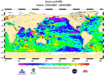
As the EOS program moves on, some of the companion satellites shown in the diagram on Page 16-7 will be launched. One of these, JASON-1, was placed in orbit on Dec. 7, 2001. A joint endeavor between NASA JPL and the French Space Agency, it will provide improved wind speed measurements over the oceans and will yield data giving more detailed ocean surface topography. Here is one of the first products made public in 2002.
When these EOS satellites are all up and flying, they will represent one type of Satellite Formation Flying configuration. Another is the NPOESS program which will be developed in the first decade of th 21st Century. Page 16-11 discusses these innovations.
Dr. Mitchell K. Hobish, Consultant (mkh@sciential.com)