Evidence for Global Warming:
Contents
At first glance, the themes considered under the purview of Earth System Science (ESS) might seem to be a hodgepodge of unrelated subjects. While the actual interrelationships may at first glance seem unconnected on this page, it does give several examples of some of the frequently cited topics in different subjects under study (e.g., volcanic eruptions, ocean parameters (particularly sealevel rise), the Greenhouse effect, polar temperatures; El Niño; the Ozone Hole), while showing how observations from space contribute to monitoring these phenomena. Of special interest are the predicted changes in temperatures, sugar maple distribution, and grain yield, regionally or globally, if the current mean carbon dioxide content in the atmosphere is doubled.
Evidence for Global Warming:
Degradation of Earth’s Atmosphere; Sealevel Rise; Ozone Holes; Vegetation Response
“Global change”. “Greenhouse effect”. “Global warming”. The media are full of statements, concerns, guesses, and speculation about these phenomena, as scientists and policy-makers around the world struggle to address recent scientific observations that indicate human activities impact our environment. And yet, each of these is a “natural” phenomenon, as are many others. Hurricanes, droughts, and monsoons all occur without any control by humans, to initiate, forestall or moderate them.
We can learn about our planet’s interacting physical systems by observing the results of such natural phenomena, and use our knowledge to explore human-induced changes. Consider, for example, the eruption of a volcano, such as Mount Pinatubo in the Philippine Islands in 1991, that happened without human intervention. This volcano had been dormant for more than 600 years.
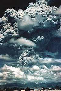
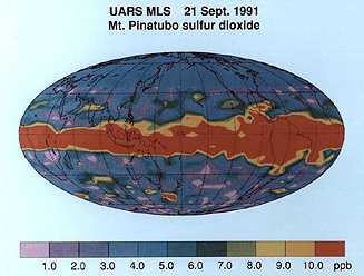
When a volcano erupts it spews millions of tons of ash, debris, and gases into the atmosphere, not to mention the lava flows from some volcanoes. Because of the presence of instruments - on the ground, at the ocean’s surface, and in space - we observed a cloud of sulfur dioxide (SO:sub:2), emitted by Pinatubo, make its way westward, extending well past India within twelve days of the original eruption. By three months, that cloud had completely encircled the Earth, as shown from space (below), and inside of a year SO2 particles in the atmosphere were providing gloriously-colored sunsets all over the globe and lowering global temperatures, as well. Clearly, an erupting volcano impacts more people and places than just within its immediate vicinity.
` <>`__16-4: Why does the Pinatubo ash tend to stay confined to a wide equatorial zone? `ANSWER <Sect16_answers.html#16-4>`__
Mt. Pinatubo offers a stellar example of how monitoring from space can continually update the status of transient ground events (that, in unpopulated areas [not the case in Luzon] may go unnoticed. Below are two SIR-C radar color composites (L-band HH = red; L-band HV = green; C-band = blue) taken in May (left) and September (right) of 1995, both showing the effects of the 1991 eruption. Ash from an earlier phase of the 1991 event appears in red just above the summit of the volcano` <Sect16_02.html#1>`__.
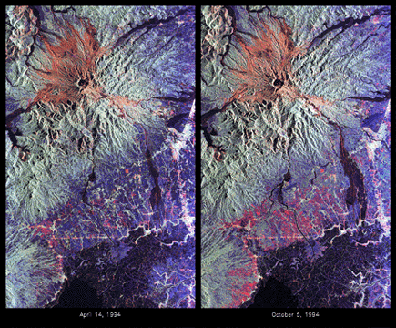
` <>`__16-5: There is one noticeable change in the right radar image. Find it. Make a guess as to its cause (clue: the volcano didn’t erupt between May and September of 1995). `ANSWER <Sect16_answers.html#16-5>`__
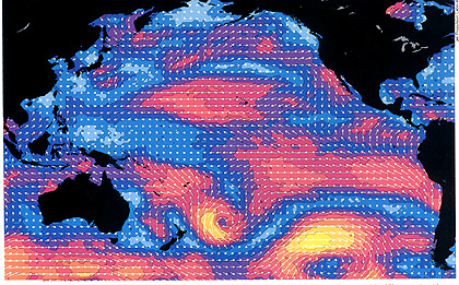
between 1982 and 1983; the bottom image shows that the El Nino warming of 1982 had largely abated by the end of 1983.|
In addition to the observed phenomena described above, scientists have accumulated other relevant, environmental recordings. For example, levels of several trace gases in our atmosphere have been rising and continue to rise. This change in atmospheric gas composition may be the most serious threat to the global well-being of Earth’s environment. Information about this has been nicely summarized in an October, 1997 pamphlet entitled Climate Change: State of Knowledge, prepared and distributed by the President’s Office of Science and Technology (OST), from which information and selected illustrations on this page have been extracted.
One of these gases, carbon dioxide (CO:sub:2) has been increasing at an accelerating rate since the middle of the last century, after many, many years of essentially stable levels. Why is this? A simple explanation is that the Industrial Revolution began at about the time these increases started. With that social upheaval, came the use of biomass and coal for fuel to support these new industries. Burning such material generates CO2.
Other trace gases have been rising, as well. Carbon Monoxide (CO) is particularly deletorious. Methane (CH:sub:4), from rice paddy production and enteric fermentation, is increasing, as are chlorofluorocarbons (CFCs) that have been used for many years as a refrigerant and to produce foam.
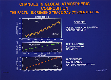
` <>`__16-6: The carbon dioxide curve shows regular oscillations (much like a sine curve). Why? With what do these three curves best correlate? `ANSWER <Sect16_answers.html#16-6>`__
These gases contribute to the greenhouse effect that is warming our atmosphere to the levels we now record. The greenhouse effect results from the trapping of solar radiation that reflects from the Earth’s surface by these (and other) gases. This is illustrated below.
|Diagram illustrating the mechanisms involved in the Greenhouse Effect |
The atmosphere is essentially transparent to incoming solar radiation. After striking the Earth’s surface, the wavelength of this radiation increases as it loses energy. The gases we discussed are opaque to this lower energy radiation, and therefore trap it as heat, thereby increasing the atmospheric temperature. As these gases increase, due to natural causes and human activity, they enhance the greenhouse effect, and may raise temperatures even more. If the climate warms, the vegetation belts will tend to move northward, changing global ecological and biome patterns. Other effects may be discerned in precipitation patterns, sea level changes, and more.
Clearly, global mean annual temperatures are rising, and we continue to monitor this condition with space observations to help settle the question: how much is just a natural trend (e.g., inevitable interglacial warming) and how much is due to man’s activities? Calculations show that the burning of fossil fuels (mainly coal, petroleum derivatives, and natural gas) add about 6 billion metric tons of carbon (as the element) to the air annually; each year also, deforestation permits an extra 1-2 billion metric tons of carbon to reach the atmosphere.
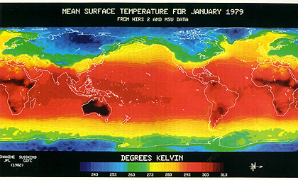
As an indication of how much worldwide temperatures have risen in the last few years, this next map of the globe shows temperature anomalies, with measurements from various sources as compiled by NASA GISS (Goddard Institute for Space Science), for the 9 month period in 2001 as shown.

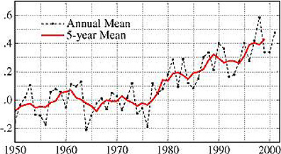
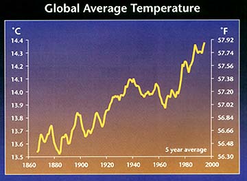
The trend of temperature changes on an annual and 5 year running average proves that in the second half of the 20th Century the global atmosphere has been slowly warming - about 0.5 ° C, as shown here:
Scientists need to establish a long-term data base, which includes temperatures from previous centuries. One way to estimate past temperatures is from CO2 measurements of air trapped in glacial ice that has been accumulating for thousands of years. The plot below shows the general trend in rising CO2 during the last 160,000 years (includes recent ice ages), with estimates of temperatures (derived from a CO2 model) shown for comparison.

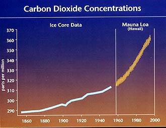
The next two graphs provide more details on the increasing levels of CO2 during the last 140 years. The top shows carbon dioxide concentration increases, based on ice core measurement until 1960 and Mauna Loa Observatory measurements thereafter. Below it is the measured temperature changes averaged for the entire world; the trend upwards, amounting to about 1.5° F, shows some irregularities (not smoothly cyclic) which result from other climatic factors.
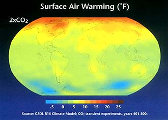
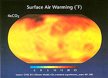
Armed with the data that relate CO2 increase to temperature rise, models allow prediction of the global distribution of changing temperatures if the total amount of carbon dioxide in the air were to double or quadruple from today’s values (arbitrarily set at 275° F). The 4x case could be truly catastrophic, leading to worldwide deserts unless the added heat in the atmosphere also notably increase vegetation growth (to tropical forms). Thus:
One obvious consequence of the significant rise in CO2 in the northern polar latitudes would be melting of Arctic Ocean and Greenland Ice Cap ices, releasing huge quantities of stored water that would have an extremely serious impact on global sea levels. A rise to 550 ppm CO2 by the end of year 2100 would bring about rises from 8 to 37 inches, enough to greatly modify present beach and shoreline configurations and even submerge such cities and New Orleans and Venice (which is also presently sinking because of groundwater withdrawal).
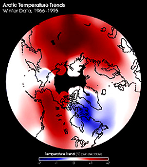
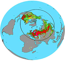
Evidence has been building, through satellite and ground measurements, that the Arctic region of the northern hemisphere has been steadily warming. This is summarized in this map of that upper hemisphere using data from the last 30 years. The Arctic ice shelf has responded by thinning. Further south, the western U.S. and Siberia are both in a warming trend. Note that the only region that has cooled during this time is in eastern Canada-Greenland.
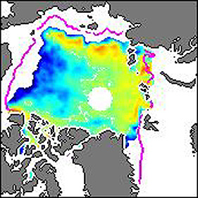
The net effect has been an overall shrinkage of the outer extent of the main sea ice cover within the Arctic Circle, as indicated here (lavender line is 1987 position; blues indicate decrease in ice thickness whereas yellows and reds show some thickening).
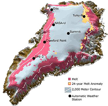
Despite the interior cooling of Greenland (suggesting enough snow to increase the ice cap’s thickness), the edge of this ice cap is currently shrinking as confirmed by two separate aerial/ground studies in which remote sensing played a part. A NASA team made survey passes across Greenland by air using a laser altimeter to measure elevations. A second group used the Global Positioning System (GPS) (page 11-6) to track movements of ice. When both results were analyzed, the map shown below was constructed. It shows increase in ice in the central part of this huge island (possibly related to the recent winter cooling) but significant shrinking near the edges (increases in summer temperature). The net loss of ice is estimated to be 51 cubic kilometers a year, enough to fill a lake 30 miles long, 30 miles wide, and 70 feet deep (spread globally to the oceans this would cause a rise of 0.005 inches a year; this contributes 7% of the total rise now being measured).

This map shows similar results from a different perspective:
Scientists visiting Greenland in the last few years have remarked about significant increases in the onset of melting along the edge of the western fringes. This is visible in MODIS images taken from 2001 into 2003, with the zone of active melting showing up as a darker gray (presence of water):

On page 14-14 evidence of major changes in Antarctica were discussed. This is in response to notable rises in temperature; in the Antarctic Peninsula, a cumulative rise between 2 to 3°C (3.6 to 5.4°F) has occurred in recent years. In the late few years parts of the fringing ice shelves have broken loose as massive ice bergs floating northward. Use of laser altimetry and interferometric measurements of data obtained by InSAR (Interferometric SAR) are showing up as annual velocities of ice movement both within the continent and along its edges, as seen in this composite image:
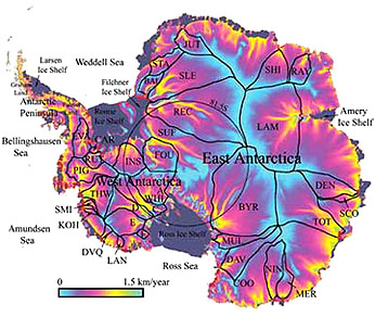
The Antarctic ice shelves appear in gray in this map. Letters indicate 33 named glaciers. As the ice sheets thin and break off, the glaciers respond by increased (accelerating) outward flow. The West Antarctic ice sheets (primarily the Ross Shelf) are losing ~65 cubic kilometers per year, enough to raise ocean levels by 0.16 mm/yr; worldwide sealevel is rising by 1.8 mm/yr (0.7 inches/yr), primarily from Arctic, Antarctic, and Greenland sources. Scientists have calculated that if all of the ice in Greenland and the Antarctic were to completely melt through significant warming the worldwide sealevel would rise 70 meters (230 feet), which would be catastrophic to the large fraction of global populations living near continental edges
Another sign of global warming would be shifts in the distribution of both natural vegetation and food crops. Consider this next diagram which is a map pair showing, on the left, the current range of the common sugar maple with the shift that could occur from just the predicted temperature rise associated with a CO2 increase to 700 ppm, and, on the right, a more drastic withdrawal northward if soil moisture reduction is included. This happens simply because the climate zone that favors this maple is sensitive to specific temperature and moisture ranges.

This shift in vegetation is still being demonstrated. Measurements of green leaf distribution and other measures of vegetation (various Veg. Indices) over the last 20 years using satellite data have now revealed a substantial increase in the “greening effect”. A study reported in the journal Science includes a map that shows the regions of the world that have experienced greater vegetation development and areas losing vegetation, largely as a result of climate changes:
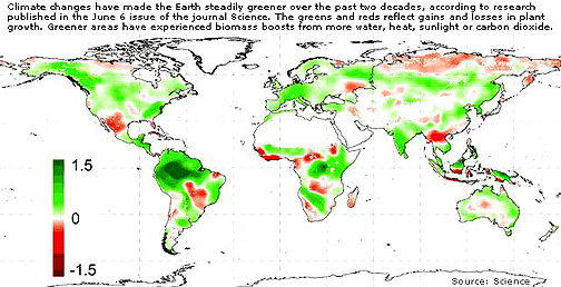
In parts of the northern hemisphere, the increase seen in this summary diagram (purple is highest; green lowest increase) shows a distinct distribution in parts of Europe, Asia, and North America. The first Spring leafing is now about 1 week earlier and Fall loss of leaves is almost a week later. The most likely explanation is the warming effect of greenhouse gases and the greater availability of CO2.
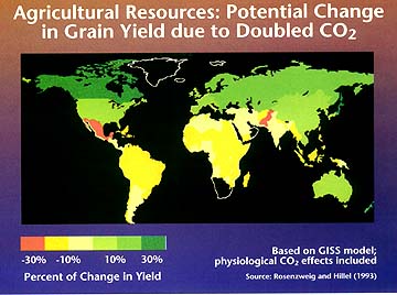
Even more alarming would be the changing conditions that are suitable to supporting certain staple crops. A CO2 rise to 550 pm would redistribute crop yields worldwide for common grains, as shown below. Note that warming in the higher latitudes of the northern hemisphere would favor increases in crop production in Canada/Alaska, Scandinavia, and most of Europe and Russia but changes in South America and most of Africa would move towards drops in yield.
Another observable global change, caused by certain trace gases in the atmosphere, including the CFCs, is the depletion of stratospheric ozone. Ozone in the stratosphere absorbs incoming solar ultraviolet radiation (UVR) that is dangerous to living systems. This UVR causes damage to the genetic material in living systems. Ozone prevents the UVR from reaching the Earth’s surface , and so protects us from its harmful effects. Spacecraft sensors have observed ozone depletion during the Antarctic winter, an observation that helped determine the chemistry underlying this process. Over the south pole, the right combination of cold stratospheric temperatures, ice crystals (or other solids with surfaces upon which the destruction chemistry occurs), and the global wind patterns intensify the process. Space sensors have observed similar (although smaller) depletions in the Arctic, and some of the chemical agents are increasing over mid-latitude regions, i.e., where most humans live.
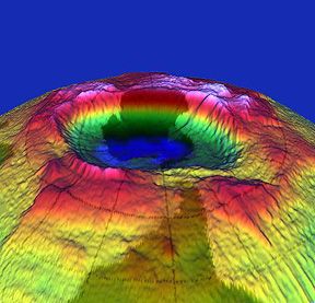
These depletions have come to be known as “ozone holes”. That this is an apt description is evident in this image of the Antarctic variations in ozone level that have been depicted in 3-D by “contouring” the different values:

` <>`__16-7: Comment on the patterns of ozone change you decipher from the above October sequence. `ANSWER <Sect16_answers.html#16-7>`__
Other human activities may increase the rate of global change. One activity now grabbing attention is deforestation, whereby humans slash and burn, or just clear-cut, huge tracts of trees to use the land for agriculture or the wood for building shelters. As developers denude these large regions, biodiversity decreases, and land-use, water run-off patterns, and local weather phenomena change. Satellite remote sensing has produced dramatic images of progressive deforestation, as witnessed in these two scenes taken five years apart over the State of Rondonia in the Brazilian Amazon Basin by NOAA’s AVHRR.
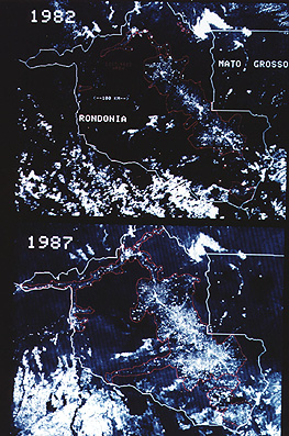
` <>`__16-8: Estimate the percentage increase in deforestation in the middle of the image pair (eastern Rondonia).`ANSWER <Sect16_answers.html#16-8>`__
All in all, the evidence seems to be mounting that there is a definite increase in regional and global temperatures. One sign, not commonly cited, is the progressive migration toward the poles of various animals and birds. In North America, rattlesnakes (very sensitive to temperatures) have moved into New England and the Canadian Great Plains. Tropical and desert birds found in Mexico are now spilling over into Texas and Arizona. Populations of the Snowy Owl have been decreasing in the Arctic (ecologists surmise that this is due to a large drop in the lemning population, the owls chief food source). Some of this temperature rise may by natural (warming trends during interglacial intervals are the norm); some is now recognized by experts as the consequence of manmade perturbations to the atmosphere.
Thus, many observations and other data seem to point to humans as a major causative source, having at least the potential for modifying global phenomena. However, we are not always sure of this. We continue to wonder if some of the observed changes, such as an apparent increase in atmospheric temperature, are really due to human activities? Or are they part of a natural cycle that we are only now observing in detail, because of the presence of instruments and sensors that were hitherto not available? We also ask whether the current trends will continue and how detrimental they may be.
Primary Contact: Nicholas M. Short, Sr. email: nmshort@nationi.net Dr. Mitchell K. Hobish, Consultant (mkh@sciential.com)