The Heat Capacity Mapping Mission (HCMM); Weather Satellites
Contents
The Heat Capacity Mapping Mission (HCMM) was an experimental satellite program dedicated to determining how useful temperature measurements could be in identifying materials and thermal conditions on the land and sea. Although day and night thermal images were valuable visual guides, the determination of one of the physical properties of materials, thermal inertia, was the ultimate goal. The scenes acquired covered large areas at higher resolution than meteorological satellites. Many proposed applications were proven valid. The principles of interpretation can also be applied to thermal data gathered routinely by meteorological satellites; examples of three thermal band images of clouds, and the corresponding visible image, taken in June 2000 by the GOES-11 geostationary satellite illustrate the features evident at different wavelengths.
The Heat Capacity Mapping Mission (HCMM); Weather Satellites
On April 26, 1978, NASA launched a sensor system capable of measuring temperatures and albedo, from which the apparent thermal inertia (ATI) of parcels of the Earth’s land and sea surfaces can be estimated. This was the Heat Capacity Mapping Mission (HCMM). It used a two channel radiometer: one channel detected visible to near- IR radiation, 0.5 to 1.1 µm, and the second detected emitted thermal IR, 10.5-12.5 µm interval. Following a near-polar, Sun-synchronous, retrograde orbit, at a nominal altitude of 620 km (385 mi), the satellite passed south to north over acquisition targets in the early afternoon (about 2:00 P.M. at the equator) along pathways inclined at 7.86° to longitudinal lines. Night passes were also inclined at 7.86° , but in an opposing orientation relative to longitudinal lines, so the day and night paths were symmetrical. A night pass, descending north to south, covered its target between 1:30 and 2:30 A.M. local time. It imaged the same area about 12 hours later (one-half diurnal cycle in eight orbits) at latitudes from 0° to 20° and 35° to 78° . It imaged again 36 hours apart (one and a half cycles) between 20° and 35° latitude (of course, cloud cover compromised some images). The repeat cycle, covering approximately the same area in the day-night pattern, was 16 days. The altitude and sensor optics produced a swath width of 715 km (445 mi) and a spatial resolution of 500 m (1640 ft) for the visible channel and 600 m (1968 ft) for the thermal channel, whose sensitivity (ability to discriminate differences) was about 0.4° K at 280°K.
Because the day and night passes over the same areas along paths were acquired at opposing inclinations, and individual pixels scanned by the thermal sensor therefore do not precisely cover the same ground areas (Instanteous Fields Of View), i.e., do not coincide, it is necessary to co-register equivalent ground plots using a computer program that uses specific control points (features recognizable at the 600 m resolution) to tie the two scenes together. Once the pixel sets are registered, then we can calculate the temperature differences (δT) for a particular cycle from the values obtained at the mid-afternoon and middle of night times (note that δT will not be maximum since the coolest time is several hours later, around dawn). We can derive the apparent albedo ‘a’ (ranging from 0 to 1 [the maximum is equivalent to 100% reflection]) from the Day Visible channel values. These values are the sensor-obtained values needed to calculate ATI according to the formula: ATI = NC(1-a)/δT, where N is a scaling factor (set at 1000) and C is a constant related to the solar flux (irradiance), generalized for a given latitude. There are no discrete units for ATI; the values are relative. Images made to display variations in ATI for a scene show high values (small δ Ts and/or low albedos) as light tones and low as dark tones. Day and Night temperature images follow the usual convention of light as warm and dark as cool. We must interpret these images cautiously, because many of the variables mentioned earlier in this Section can affect the temperature state at any or all point(s) and usually we can’t control them or measure them. ATI, then, is only an approximation to actual thermal inertia, that does not take into account atmospheric properties and other factors difficult to ascertain from space.
` <>`__9-16: Calculate the ATI for a material that attains a temperature of 30° C in the day and 15 °C at night. The apparent albedo is 0.3. For this case, at a latitude of 40° N and a date of June 21st (summer solstice), the constant C = 1.605. (Note: in some instances, the formula is further simplified by setting N = 1; this gives ATI values in the same general range as we observed earlier for P).`ANSWER <Sect9_answers.html#9-16>`__
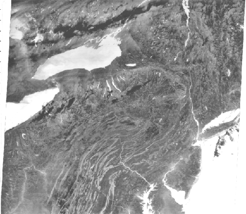
We begin our look at HCMM images with this instructive full Day Visible scene that extends for more than 640 km (398 mi) across and in so doing, completely encompasses the state of Colorado as well as parts of surrounding states, from the Great Plains in Kansas, west into Utah and north into Wyoming, as located in the accompanying map.

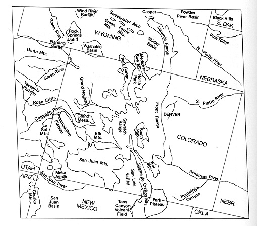
The Rocky Mountains stand out by their dark tones, caused mainly by coniferous vegetation, in sharp contrast to the lighter tones associated with the Plains and Basins. The lofty Rockies are somehow less impressive when flattened in this image.
To gain a feel for the thermal images, let’s examine several HCMM scenes that capture part of the northeast U.S. and neighboring Canada. Look first at a 467 km (290 mi) wide section extracted from a full Day Visible-Near IR image obtained on September 26, 1978.
the states of New York and Pennsylvania.|
The largest scale features are Lakes Ontario and Erie. The Finger Lakes of New York are evident. The main rivers in the scene are the Susquehanna and Delaware Rivers, visible mainly in the lower right third of the image. Philadelphia and New York City appear as dark tones. Compare this image with the MSS Band 5 view of the same area shown in the Introduction. The regional geology is dominated by the Coastal Plains and Piedmont (lower right), the fold belt of the Appalachians, the Appalachian Plateau, and glaciated upstate New York into Canada (upper left). In the right center is a narrow, curved dark pattern that we identify as the Wyoming Valley of eastern Pennsylvania (Wilkes-Barre/Scranton areas), a major anthracite coal belt. Note the few cumulus clouds.
The Day Thermal image taken at the same time presents distinct differences.

The thermal structure of the lakes is evident. Similar to the Thematic Mapper Band 6 image, Lake Erie is warmer than Lake Ontario. The white clouds west of Buffalo are depicted as very dark (cold) in the thermal image, consistent with their generally low temperatures as condensation in the atmosphere. Much of the land shows in medium grays. Very dark areas associate with the fold ridges and with sections of the Appalachian Plateau. These areas relate to heavy deciduous tree cover in these mountainous areas. The trees cool their surroundings by evapotranspiration. Five major metropolitan areas - Buffalo, Rochester, Syracuse, New York City/New Jersey, and Philadelphia/Wilmington - stand out as very light tones, indicating warmer temperatures. A few rural areas also are light (warm) for reasons not obvious. But the Wyoming Valley stands out from its surroundings by its very light tone, which is the result of higher radiant temperatures caused by the widespread dark shale, mixed with black coal dust (blackbody effect).
Next, we show a nearly cloud-free full image of nearly the same area, but extending into western New England, across Long Island and down to the mid-Chesapeake Bay. This image in the night of November 2, 1978. Lakes, rivers, and the ocean appear much warmer than the cooler land. This is an apparent paradox: even though the water has cooled somewhat during the night, it normally experiences smaller δTs than the land.
During the day water is notably colder than the land, and in the night it appears warmer than the land, because of its heat retention and the commonly larger drop in land surface temperatures. This plot may clarify this idea.
variations measured in the day and the night thermal IR HCMM images; this illustrates how the choice of levels could result in a darker tone for a higher temperature in the day image compared with a lighter tone for a lower temperature in the night image.|
This plot shows the assignments of gray tones as a function of radiant temperatures for the Day and Night images. Here, a temperature of 285°K on the land has a darker gray level than a temperature of 270°K for that same surface in the night. If (case not shown in the plot), water during the day had a temperature of 280°K and dropped at night to 275°K, we can extrapolate these values to the two straight-line plots: the 280°K gray level would be very dark and the 275°K level would be lighter than the corresponding land value. This reasoning accounts for the relative land-water gray tones noted in the Day-IR and Night-IR images shown above.
In the Night-IR image, cities are slightly warmer than their surroundings. The ridges in the folded Appalachians appear warmer, largely because they have dropped their leaves (thus, no longer cooling by evapotranspiration), and underlying rock units contribute to the thermal response. The Wyoming Valley is not emphasized by warm emission from the coal/dark soil surface and is only locatable from the ridge pattern enclosing it. Some valleys appear conspicuously dark, perhaps because of cold-air drainage from uplands. Dark cloud banks (cold) are evident north of Lake Ontario.
` <>`__9-17: Bring back to memory your knowledge of the Harrisburg region you built up from taking the test at the end of Section 1. In the visible and thermal images shown on this page, locate features from the test scenes and note their tonal patterns in the thermal images. `ANSWER <Sect9_answers.html#9-17>`__
The first ever space-acquired ATI image came from satellite observations of this eastern U.S. area (HCMM Day images on May 11 and a night image on June 11, 1978).
Water has a very bright tone, as do clouds (upper left) and snow (not in this image). The value of (1 - a) is near the maximum for water (with a moderate δT), hence a large ATI. But, for clouds and snow, having high albedos, thus tending to lower ATI, the δT is quite low, countering the (1 - a) effect by raising ATI (because of its position in the denominator). A typical ratio of (1 - a)/δT for water is 0.98/3 = 32.7; for snow is 0.40/2 = 20.0; and for moderately reflective soils is 0.70/20 = 3.5. As a generalization, vegetation has moderate to low ATIs, as do many soils, while basalt has a very low and granite a moderate-to-high ATI. Heavily forested areas in the Appalachians are dark, denoting low ATIs. Those soils in the Piedmont and Coastal Plains, where they are exposed better because of fewer trees, have somewhat higher ATIs. We can crudely separate the Piedmont rom the Plains by its lighter tones.
The same Day-thermal image, which we used as partial input in making the following ATI image, reveals a prominent thermal pattern in the Atlantic ocean, when we assign colors to the different calibrated temperatures.
|A Day-IR HCMM thermal image of the eastern U.S. and Atlantic Ocean in which the temperatures have been assigned colors (yellows, browns, white = hotter; blues, purples, and greens = cooler). |
` <>`__9-18: Account for the black, purple, and blue colors on the continent. Where is the coldest part of the Atlantic Ocean in this scene? What is responsible for the green band in that ocean? `ANSWER <Sect9_answers.html#9-18>`__
Several shades of darker blue mark zones of colder water. Near the bottom, within a lighter blue body, is a greenish curving pattern that represents the somewhat warmer Gulf Stream moving northward enroute to the Outer Banks off Newfoundland.
A Night Thermal-IR image made on December 20, 1978 of the Gulf Stream east of Florida and of waters around the Bahamas, Cuba, and the Gulf of Mexico indicate rather complex thermal patterns in the seawater. Some of this may relate to thin cloud cover over stretches of the ocean. Note that all land is dark (cooler), so that it is hard even to find the Bahamas.

Nighttime thermal images taken at different times of the year can be quite different in tonal representations and hence in temperatures. Look at this pair of Night-IR HCMM images of the western Mediterranean in which the northern half of Italy, Sardinia, Corsica, the French Riviera and some of the Alps are displayed. Note the main differences.
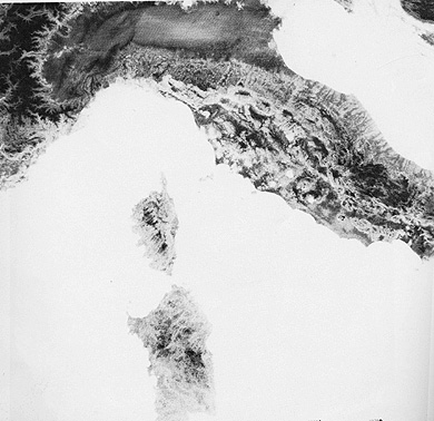
In the July image, the land is almost uniformly cooler than the seawater. In the latter, subtle thermal patterns, to some extent the result of variable winds in different areas, are visible. The cooler gray pattern on the left results in part from Rhone River water entering the Mediterranean. Blackish areas over the sea are cold clouds. The November scene was processed to bring out temperature variations on the land. A contrast stretch lumped lighter tones in the seawater into a single value, thus shifting the darker pixels into a stretch that emphasizes smaller temperature difference. On the land, higher elevations are darker, valley/lowlands are lighter.
JPL operated HCMM to prove, or get further insights into, applications in most of the same disciplines addressed by the Landsat program. Among the objectives successfully investigated were:
Production of thermal maps useful in distinguishing rock types and locating resources
Measurements of plant-canopy temperatures to determine stress and transpiration
Monitoring soil moisture content and changes during seasonal and diurnal cycles
Pinpointing natural and man-made effluents and observing thermal gradients in water
Prediction of runoff during repeated coverage of snow fields
Correlation of urban heat island effects with local climatological changes
To evaluate two geological examples of what HCMM can accomplish, we turn first again to the Death Valley region, now expanded in this HCMM color composite to cover a wider area. In this rendition, the bands were assigned these colors: Day IR = blue; Day Vis = green; Night IR = red. As interpreted and Anne Kahle of JPL, many rock units can be discriminated as groups by the different colors. But, in fact, a group may contain several rock types or categories that are considered distinctly different in composition and character by geologists.

Dr. Rupert Haydn of Bavaria has made a fascinating special product in which the Death Valley Landsat scene (here cropped to show only the northwestern 60%), comes from a TM 4 image (I), convolved with the TM 6 thermal image (H) and a HCMM Day IR image (S). These letters in parenthesis refer to a different method for making color composites known as the IHS system, where the three primary colors are assigned to derived intensity (I), hue (H), and saturation (S) parameters.
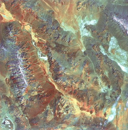
Again, reds denote hot, blues cool, and yellows and greens intermediate temperatures. As with the Thermal IR Multispectral Scanner imagery, the alluvial fans show in reds, some salt deposits in blues and greens, and certain playa beds in yellow.
Now, consider this definitive example of a geological application of HCMM data, developed by Anne Kahle and her associates at the Jet Propulsion Laboratory.
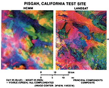
The area examined is in the eastern Mojave Desert of California, in which basin and range topography similar to the Death Valley region dominates the landscape. The color image in the upper right is a Principal Components Composite, using the four Landsat Multispectral Scanner bands. Correlation of color units with rock types and deposits mapped in the field is expressed in the map at the lower right. Of particular interest is the heavy lined feature near center, which encompasses a basaltic cinder cone and associated lava outpourings known as the Pisgah Crater. The corresponding scene (upper left) constructed as a composite of HCMM Day IR (blue), Night IR (red) and Day Visible (green) shows similarities and differences. Alluvium clearly shows in blue tones, and more silicic volcanics appear in red. The lava flow emanating from Pisgah Crater appears now to consist of two units, poorly separated in the PCA product: basalt with a pahoehoe-like (ropy) texture and basalt with a (cindery) texture.
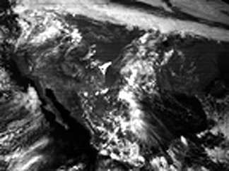
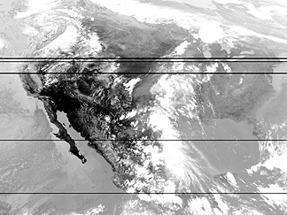
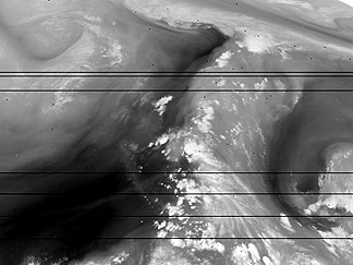
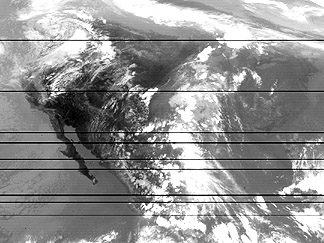
Sensors operating in the 3-6 µm and 8-14 µm regions have been on many of the meteorological satellites flown now for four decades. This will be considered more specifically in Section 14. For now, here is one series of images taken from the GOES-11 satellite (launched in Spring 2000) showing western North America. In this June 10, 2000 sequence, four channels are represented: 1) Visible (general cloud distribution); 2) 3.9 µm (good forest fire detector); 3) 6.7 µm (water vapor); 4) 12 µm (cloud decks).