The Pennsylvania Power and Light New Plant Siting Problem
Contents
` <>`__
In the next two pages, you will see how the search for the best site for building a new electric-generating power plant near Harrisburg, PA, using both GIS and other information, is conducted step-by-step. This was part of a demo organized by NASA Goddard�s ERRSAC both to the client (PP&L) and to the general user community. On this page are shown some of the data elements considered as input, a Landsat-based classification, and a series of thematic maps derived from data files at PP&L, state agencies at Harrisburg, and other sources.
The Pennsylvania Power and Light New Plant Siting Problem
Perhaps GIS analysis will come through more convincingly with a second case study. This case is an applications demonstration, developed at NASA Goddard during the early 1980s, when its Eastern Regional Remote Sensing Applications Center (ERRSAC) still operated. The “client” was the Pennsylvania Power and Light (PP&L) Company, a public electric utility, whose service areas include parts of central and eastern PA. One service area is the state capital district at Harrisburg on the Susquehanna River that had been receiving much of its power from the infamous Three Mile Island, site of a near-catastrophic nuclear power-plant accident on March 28, 1979. This experience forced PP&L to have special concerns regarding any of its future sitings, for its own power facilities and for its large customers. Specifically, long range planning called for a possible second generating plant to be constructed in the Harrisburg area. Could both GIS and remote sensing inputs help in the decisions involved in site selection?
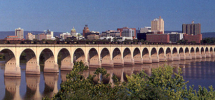
To refresh your memory of what Harrisburg looks like (you would have seen a picture looking northeast from the Interstate 83 bridge in the Exam at the conclusion of Section 1), we show a very similar photo here:
By the late ’70s, PP&L had developed a computerized GIS database primarily for land use analysis, environmental impact analysis, energy facility siting, and other technical assistance. Its multivariate data base consisted of 43 data elements distributed in ten general categories, the two largest being terrain units and land use. These are shown in this table:

The standard grid cell size in this data base is 9.2 hectares (22.9 acres). The question prompting PP&L to approach ERRSAC in setting up a cooperative study: Can Landsat images help keep the GIS outputs up-to-date?
` <>`__15-15: Landsat MSS resolution is equivalent to 1.1 acres. How did this fact influence PP&L in its thinking about utilizing space imagery in its geocoded data base? `ANSWER <Sect15_answers.html#15-15>`__
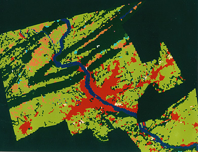
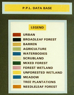
From these files, ERRSAC investigators used an ESRI software package to generate a 12-class map of the Harrisburg service area:
The proof-of-concept task presented by PP&L for a Goddard-directed GIS analysis was to select optimal site(s) for a heavy industrial complex. Two primary limitations were imposed: 1) the site must be within 5 km (3 mi) of a major source of water (the Susquehanna River met this condition), and 2) should exclude areas in the immediate Harrisburg district.
The first step in the analysis was to generate a series of data element maps from the PP&L data base. Initially, these were formatted as printouts using a black and white Versatec Electrostatic Plotter. Here is the output for landform types, as data layers (this figure suffers from the inability of the scanner to differentiate the symbol patterns, some of which are too similar to be resolved):

After completing these printout maps, many were converted to color-coded renditions. Below is a set of six (of the 23 total produced) thematic maps using PP&L data digitized at ERRSAC to become part of the multilayered inputs to the algorithms that were used to select acceptable site(s) for the proposed power plant. See description underneath each map as identified by letter for theme represented and values associated with colors used.
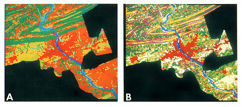
A. Landforms: Urban = Red; Water = Dark Blue; Dissected Plateau = Brown; Steep Slope = Dark Green; Valley Bottom = Greenish-yellow; Depression = White; Floodplain = Aqua
- B. Slope: 0 - 3% = White; 3 - 8% = Light Green; 8 - 15% = Dark Green; 15 - 25% = Purple; > 25% = Yellow; Urban = Red; Water = Dark Blue
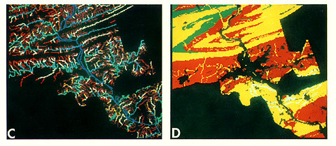
C. Stream Order: 1st = Dark Blue; 2nd = Orange; 3rd = Aqua; 4th = Light Blue; 5th = Yellow; 6th = White; 7th = Purple; 8th = Red
D. Soil Permeability: Very High = Dark Green; High = Red; Good = Yellow; Moderate = Orange; Poor = White
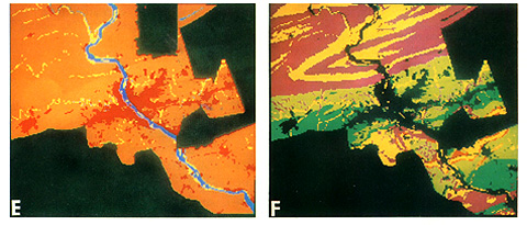
E. Flood Prone Areas: Urban = Red; Water = Dark Blue; Flood Prone = Yellow; Not Flood Prone = Orange
F. Agricultural Potential: No Limit = Dark Green; Few Limits = Light Green; Moderate Limits = Yellow; Severe Limits = Brown; Extreme Limits = Purple
These, and other, maps were helpful to the GIS interpreters and the planners in visualizing the distribution of variations within a given attribute. In the analysis, they stored the different categories within a theme and manipulated them by ordinal rankings in a numeric code.
` <>`__15-16: Which, if any, of these maps could Landsat have made some direct contribution to, perhaps aided by supplemental information? `ANSWER <Sect15_answers.html#15-16>`__