History of Remote Sensing: MSS Histograms
The Landsat MSS gathers radiation over spectral band widths that integrate radiation over relatively broad intervals (0.1 and 0.3 µm). Thus, instead of the spectral signatures that continuously measure spectral response in very narrow intervals, the MSS data when plotted produce histogram-like bars that are rough approximations of the signature curves. For different classes, these still yield separable patterns that facilitate identification of the materials involved. This is illustrated for a scene in central California. A table is included (by link) that specifies relative black and white gray levels and distinctive colors by which some common materials can be identified.
History of Remote Sensing: MSS Histograms
The MSS can simulate rather crude spectral signatures. Bands 4, 5, and 6 each have a bandwidth of 0.1 µm; and band 7’s width is 0.3 µm. We represent band responses by bars in a histogram-like plot, in which the height of the bar signifies the relative reflectances averaged for all wavelengths within the bandwidth interval. This crude spectral signature we show here with an illustration from a U.S. West Coast image.
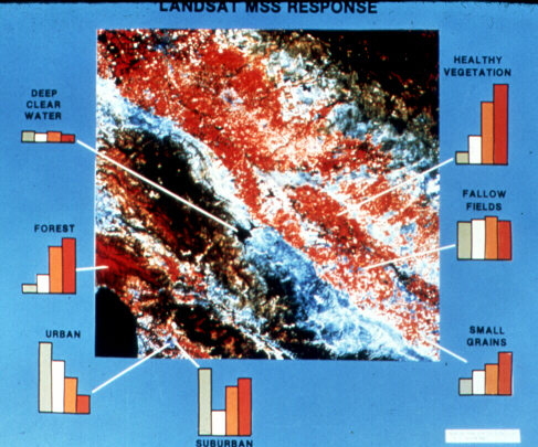
The scene is the first color composite made from ERTS-1 digital data. This includes Monterey Bay (lower left), the Coast Ranges below San Francisco, the Sacramento (Great) Valley, and the western slopes of the Sierra Nevada. Notice that the pattern of each histogram set, for a particular type of surface cover, differs from the others. Thus, each class of material has a distinctive signature, approximated by the 4 bars, that sets it apart. To simplify the plot, we made the width of band 7 (bar on the right) equal to the other three. Urban is most reflective in bands 4 and 5; suburban is strong in bands 4 and 7 (the latter is tied to the influence of live vegetation). The signatures for forest and healthy croplands are similar, but the heights of the bars for bands 6 and 7 are greater for the crops. The bar heights for small grains and fallow fields are similar, but the response for bands 4 and 5 is just a bit higher than for 6 and 7. The two very dark areas in the Coast Range and in the Sierra Nevada (not shown as histograms) result from the predominance of conifers.
Next, refer to the table that will appear on the next page in which we present some criteria for using combinations of band gray tones or colors and their patterns to identify land-cover categories. Again, apply these to recognize examples of any such categories in the previous scene. Become familiar with this table, because we challenge you to practice this approach whenever you examine various Landsat scenes (and imagery from the other earth-observing satellites) in this tutorial.
` <>`__
I-23: Print out this table; it will serve as a handy reference for other scenes in this Tutorial. Scroll back to both the New Jersey and California scenes above and apply the table criteria (gray levels; color) to features/classes you have identified earlier to ascertain the validity of these criteria. **ANSWER**