Mosaics of Los Angeles, the Mojave Desert, and the Southwest U.S.
Contents
On this page we are introduced to three mosaics, each of different origin. The first is a controlled (carefully reprocessed to match edges) aerial mosaic of southern California. The second is part of the first mosaic of the U.S. made from Landsat Band 6 images. The third is made from digitized elevation data (DEM) that allows construction of an image product in which light and dark tones are assigned by artificial shadowing so that a quasi-three dimensional picture results. To illustrate the other extreme, an enlargement of a small part of a single Landsat image of Los Angeles is presented to indicate the versatility of space imagery for a wide range of scales.
Mosaics of Los Angeles, the Mojave Desert, and the Southwest U.S.
We next view one of the best aerial photomosaics this writer (NMS) has ever seen. It was made by Aero-Service, Incorporated, through a NASA contract, during the early days of Landsat when comparing space images and aerial counterparts was a point of interest.
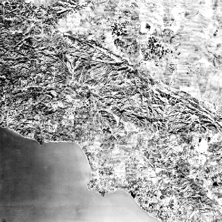
The scene shows the Los Angeles basin, the Transverse Ranges (especially the San Andreas fault), and the adjacent segments of California, which is broadly the same “real estate” as the first image in Section 4, page 4-1. On that page, look at the atlas map for part of the Los Angeles image as an aid to locating the geographic features, and note the roughly equivalent area as seen by radar, next to the map.
The black and white photomosaic, which includes the interior parts of about 8,000 photos, when reduced to a 23 x 28 cm (9 x 11 in) print, has moderately better resolution than the Thematic Mapper color composite, but the differences are not great. Because of excellent edge matching efforts, this mosaic shows little blockiness or variations in tone within each image component nor any discontinuities at the margin. In this sense, its internal purity approaches the even lighting that exists in a Landsat image, which takes about 28 seconds to scan. By varying contrast and other factors during image production, we can make a single Landsat image look similar to a photomosaic of this quality, but the latter is panchromatic (film sensitive to all visible colors). Thus it has a different mix of brightness’ (tonal patterns) than that of the more narrow spectral region in a black and white image from a particular Landsat spectral band. We can approximate a panchromatic film image by calculating the first principal component from the multiple bands in a Landsat scene and then writing this on a film recorder.
` <>`__7-4: Comment on any flaws or evidence of the individual photos used to make this mosaic.`ANSWER <Sect7_answers.html#7-4>`__
We can easily make space mosaics from Landsat (or SPOT or other imaging satellite systems) inputs. A sequence of space images is continuous and has no overlap. Generally, the next orbital line, obtained at roughly the same time the next day, gives rise to about 10% sidelap at the equator, increasing to about 40% near the poles because of longitudinal convergence. The obvious problem in constructing a mosaic that is several orbital paths wide, is that, the space paths are days apart, so that the likelihood of constant weather conditions (especially minimal cloud cover) goes down as the size of the mosaic increases. We can lessen this problem by using images with few clouds taken at different times of year, but then sun angle, vegetation state, and other factors affect the picture. So, good scene matches over disparate dates are unlikely. But, since Landsat has operated for many years, the probability goes up of getting cloud-free images at generally the same time of year over a large area. However, unlike film-based primary imagery (aerial photos), the digital format for the Landsat (SPOT, etc.) images permits a number of cosmetic enhancements by computer processing of the raw data, so that we can virtually eliminate variations in natural lighting conditions inherent to Landsat imagery acquired on different dates.
Enlarged Subscene of Los Angeles
At the other extreme, the versatility of Landsat subscene images when enlarged to show localized details is evidenced by this next pair of images made from (top) a 30 m Landsat 7 ETM of west-central Los Angeles and (bottom) a 15 m Landsat 7 panchromatic image covering part of the upper image.
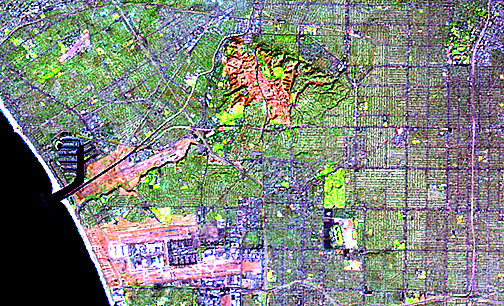
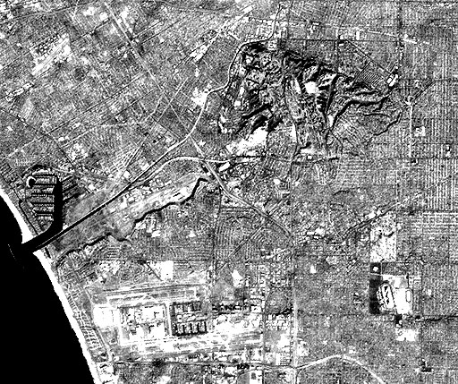
` <>`__7-5: What do you think (this is subjective) is the most obvious spatial difference between the upper and lower ETM images?`ANSWER <Sect7_answers.html#7-5>`__
The degree to which we can extract useful information from images at 30 m resolution became apparent in a situation experienced by this writer. In an enlargement of a Thematic Mapper scene containing Baltimore, Maryland, and Washington, District of Columbia, from which he produced a subset around Baltimore, he spotted the backyard of his home near Columbia, MD, because of its well-watered lawn (strong IR reflectance) relative to those of neighbors on either side whose uncared-for grasses had turned brown in the summer heat. He noticed a small black spot to the south in the image which he surmised was the apron of a swimming pool at a neighbor’s home three doors down, not visible to him because of a fence. When he asked the neighbor if the pool had an asphalt apron, the “yes” answer convinced him of the power of TM imagery to invade the “hidden” for arcane information. Still, the Landsat TM resolution is a far cry from that of some military spy systems, which, some people claim, can read license plates and locate golf balls on a course.
MSS Mosaic from San Francisco to San Diego
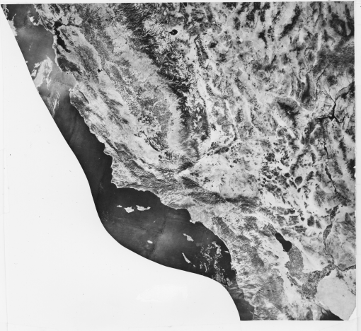
` <>`__7-6: Can you find at least two parts of this mosaic in which the individual Landsat images don’t quite fit tonally. How would this space image mosaic differ from the aerial mosaic above? `ANSWER <Sect7_answers.html#7-6>`__
Digital Elevation Models: Shaded Relief Image of CA, NV, AZ, UT
Digital Elevation Models (DEM) are digitized values of elevations (Z) at specified points (X and Y) in an array of X and Y coordinates (tied to some projection system, such as Universal Transverse Mercator). The values are codified by some DN system and are arranged in raster format. They can be used to construct topographic maps (contoured; see page 11-5 for a broader discussion of DEM uses) or shaded relief maps or other modes of showing surfaces. Two good Internet reviews of DEMs are those produced by the Wisconsin State Cartographer’s Office and the Softwright Company.
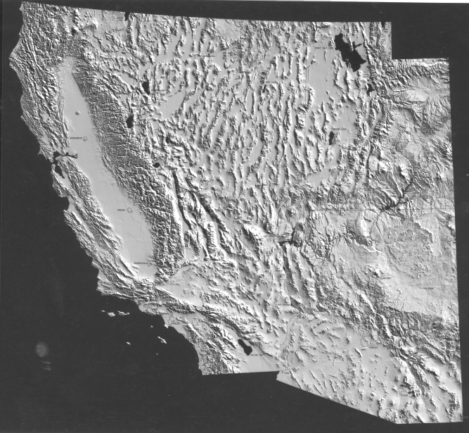
This DEM image has a scale of approximately 1:7,600,000 and a resolution of 305 m (1,000 ft), and depicts the entire states of California, Nevada, Utah and Arizona. The DEM image, with its controlled artificial shadowing, graphically shows the structural expressions of mountain-scale landforms in the physiographic provinces described on page 6-1. These provinces include elements of the western Rocky Mountains, Basin and Range, Colorado Plateau, Sierra Nevada and California Coast Ranges. Note also the flatness of valley floors corresponding to the Basins and to the Central Valley. This digital rendition also highlights the linear character of the San Andreas fault. Topographic relief is less obvious in the Landsat mosaic, but the structural features emphasized in the DEM image generally have visual counterparts in the mosaic, because elevated terrain tends to be vegetated (hence, dark in this red-band version). Thus, we see that tonal contrast substitutes for the shadowing effect in the DEM version. Areas used for agriculture (e.g., the Central Valley and Imperial Valley) show a distinctive light-dark mottled pattern. All such land use patterns are absent in the DEM version which purports only to show raw topography. At the scales and resolutions of both image mosaics, it is difficult to see any tonal or geometric patterns that would disclose the large concentrations of population. However, an alien observer from outer space presented with the Landsat image might guess at the existence of intelligent beings from the field patterns of growing crops.
` <>`__7-7: Why does this DEM image appear tonally different compared, say, to the Landsat black and white mosaic? `ANSWER <Sect7_answers.html#7-7>`__
Primary Author: Nicholas M. Short, Sr. email: nmshort@nationi.net