ANSWERS
Contents
ANSWERS
` <>`__1-1: Subjective. **BACK**
` <>`__1-2: The histogram is bimodal, i.e., two peaks. One narrow peak near a DN value of 12 corresponds to the dark tones associated with the ocean; the second broader peak near 28 relates to tones found on the land. Very few pixel DNs occur beyond 50. As plotted in this diagram, most of the values assigned as gray levels (which for Landsat can extend from 0 to 255 DNs) would be dark and the resulting image would not be pleasing to the eye nor very informative. Yet the Band 3 image as shown above has a considerable amount of light gray tones and looks “good”. The histogram here is “raw”, i.e., results from the actual DN values recorded by the sensor system. This DN distribution has been stretched to cover a wider range of gray levels, as will be discussed later in this section, giving rise to the image seen that has a suitable contrast of gray tones. **BACK**
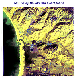
` <>`__1-3: Morro Bay itself is just below the central town of that name; note that the bay widens to the south. The large rock in the foreground (Morro Rock) is easily spotted. In the image, the breakers along the beach are evident as is the sandy beach beyond it (on its right, part of the beach is covered with dark vegetation which appears in the Landsat image as well. The range of hills in the center, running roughly perpendicular to the photo can also be readily seen in Band 3 as can the taller hills (the main Coast Range) in the upper left. Near center left, a wide barren brown area and a green field within it can be picked out in the photo. Note the five oil storage tanks just left of Morro Rock; look carefully, as these too are visible in Band 3. You probably found still other features in common. The point from which the panoramic ground photo was taken is located near the bottom left corner of the Landsat image. **BACK**
` <>`__1-4: The silty water (a in map) is medium to dark gray in TM Bands 1, 2, 3 and blackish in 4, 5, 7. It cannot be distinguished in Band 6 (thermal) from its enclosing water, as all have a black tone. The breakers (h) are whitish in Bands 1, 2, 3, mottled white-gray in 4, and dark gray in 5 and 7. They aren’t visible in Band 6. The beach sand (non-vegetated part at c) is whitish in Bands 1, 2, 3, and 7, light gray in Bands 4 and 5, and medium gray in 6. Los Osos is marked by a criss-cross pattern (the streets) and is a mottled medium gray in Bands 1, 2, 3, a somewhat more uniform medium gray in 3, 5, 7, and uniform medium gray with large whitish patches (business section?) in 6. The marshy delta (o) is medium to medium-dark in all bands except 4, which is a mottled light and medium gray. Many sunlit slopes (d) tend to be whitish in all bands (most so in Band 6) but somewhat more gray in 4. Shadows (e) are black to very dark gray in all bands; but in Band 4 some shadowed slopes are medium to dark gray. **BACK**
` <>`__1-5: This Landsat image was acquired in mid-November. At that time of year, the Sun is rather low in the sky at this latitude, so solar rays come in at lower angles. The amount of irradiation is controlled by this angle (mathematically, it varies with the trigonometeric cosine of the angle of incidence [measured relative to the vertical or normal with respect to the surface]); a low angle reduces the amount or intensity of radiation reaching the surface (in part, because for a small solid angle which would project as a square for vertically incident radiation, that solid angle for low incidence spreads out into an ellipse). Also, at low angles the pathway of solar radiation through the atmosphere is longer (hence, more absorption). So, scenes in winter time should be darker overall, and relative contrasts may be less compared with brighter summer images. Shadows will be wider in winter images (ellipse effect), so in hilly terrane the sense of relief (term which applies to relative height differences) will be accentuated. And, of course, vegetation may be largely dormant in winter scenes, reducing contrast in bands such as TM 1,2, and 3, darkening Band 4, and having some effect on 5-7. The effect of changing the time of day is twofold: first the Sun elevation (angle) changes and second Sun Azimuth (compass direction of incidence) also changes. This can have a profound influence on the appearance of mountains. A morning azimuth from the southeast causes a significant bias in illumination of slopes - those whose ridges run NE-SW will have their SE slopes illuminated and NW slopes darkened. An afternoon azimuth emphasizes mountain groups with crests running NW-SE, with corresponding SW slopes bright and NE slopes darker. In general, all Landsat images (and those from other spacecraft sensors operating with morning overpasses) have this prevailing bias in shadowing; radar imagery also has selective relief bias (see Section 8). **BACK**
` <>`__1-6: This is a good example of the role of image size (scale) and resolution. For most viewers, with 17 inch or less screens, it is very difficult to see the storage tanks in the small scale images that occupy only part of the screen. But, in the map view, the image occupies the full screen and the tanks stand out, aided by the increase in size as well as the contrast (tanks white surrounded by medium gray background). **BACK**
` <>`__1-7: No revelation here. You may be right, but we’ll keep you guessing til later in the section. The question just makes sure you accepted the challenge put forth in the text. **BACK**
` <>`__1-8: Two reasons likely account for this darkness. First, in the right corner, the land has risen to near the crest of the Coast Ranges. Being higher, it is somewhat cooler. Second, pines, redwoods, and more deciduous vegetation occur at these higher altitudes, and these tend to further cool the air by evapotranspiration. **BACK**
` <>`__1-9: In Bands 2 and 3 note the two small, very bright patches, rather rectangular in shape. These are presumably sand pits and/or rock outcrops. They appear darkest in Bands 5 and 7. Band 5 is somewhat lighter than 7 although the feature contrasts are about the same. This could be related to one or more of three things: The radiance level is actually brighter in 5; the Band 5 detector has a slightly higher gain; or, when the image is projected on the screen, or printed on paper, there is a bar scale of progressively darker gray level steps (shown in the New Jersey images in the Introduction section ) that serves to calibrate the (photo)density levels - if these are not exactly the same in two images being compared, then the effect will be an overall difference in tonal levels (all features being raised or lowered in gray level for one band scene relative to the other). **BACK**
` <>`__1-10: First off, in the early days of Landsat, people (mostly geologists) were finding linear features or “linears” all over Landsat images and (too) many called them geological in nature. Some images had hundreds of such features but field checking often failed to find them. Dr. Yngvar Isachsen of the New York Geological Survey studied this phenomenon (if all were indeed valid as faults/fractures, the oil and mineral corporation companies would have a new, ultra-powerful for exploration) and found in one image of the Adirondack Mountains that less than half were valid geologically. These fracture or fault systems were discernible mainly because they controlled erosion along the features creating straightish valleys (highlighted by shading) or were elongate depressions that were filled with water. Another common expression of faults was vegetation aligned along them because of moisture concentration. Faults also usually juxtapose rocks of different character/composition so that there were tonal discontinuities that produced straight lines. Linear boundaries are also produced at the boundary (contact) between two geologic units (formations) of differing color/composition. Among common non-geological linears are: roads, railroads, fence lines; crop field boundaries; telegraph and power lines; hedge rows. **BACK**
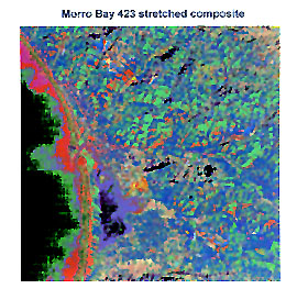
` <>`__1-11: This answer was first developed in 1998, using first principles (thought experiment) rather than examining an actual product. Read through this description now:The red and pink areas of the standard fcc now become deep to light blue. The light sun-facing slopes now are more yellowish but with some hints of purple here and there. Not much actual red will be in the scene. The sand and breakers continue whitish but with associated greenish tints. The ocean water will continue dark but with an overall weak green tone except the silt will be more green. In late 2002, the writer decided to make a false color composite, using stretched input images for band 4 = blue; band 2 = green; band 1 = red, to see how close the above predicted version approached a real outcome. Examine this image:
In broad terms, most of the prediction proved valid. But the writer was surprised by the dominance of yellow. On re-examining the stretched bands 2 and 3, most of the hills and countryside had similar gray tones, being somewhat on the bright side. Thus when rendered in green and red, the combination should indeed be yellow. The ocean does not have a green overtone but the silt does.
The color scheme assigned to produce this image uses Idrisi’s “Color Composite” choice. Out of curiosity, a second, quite different, color mode, which Idrisi calls Qualitative 256, was applied, with this result:
This is quite a departure from the standard false color rendering. Some color patterns don’t seem to make much sense. The black patches are mostly anomalous. The green color on the land associates mainly with backslopes in the hillside.
The lessons to be learned from these renditions are that one should whenever possible actually make the color composite to test the prediction and that it is fruitful to try various color assignements and to use different stretches. Some outcomes are better (more believable) than others. **BACK**
` <>`__1-12: Again, this is somewhat subjective. Clearly, the simple linear stretch didn’t do much good in improving the image, until new maximum-minimum limits were set. But that new image still didn’t have strong contrast. The linear with saturation and histogram-equalization stretches were better from the start. The saturation stretch made the hillslopes perhap a bit too bright. By a slight edge, I judge the histogram-equalization stretch best because it had a nicer balance in contrast. These stretches were done with the Idrisi processing program. My experience with other images is that usually - not always - the histogram-equalization stretch yields superior end products. **BACK**
` <>`__1-13: The low bandpass filter image is similar to TM Bands 1-3, but a bit darker. It also seems somewhat more fuzzy. But it could pass for an aerial photo. The edge enhanced image is definitely sharper, as though the image resolution has been improved. The high bandpass image is dramatically different from any others that we have seen, and seems rather “noisy”. The roads in the towns are sharply defined. But, every slope and gully in the hills also show linear patterns brought about by highlighting hill crests and stream channels. This type of image, with so much intersecting linear segments, would be difficult to interpret in search of fault and fracture patterns. Note how the horizontal scan lines are emphasized in the ocean and bay waters. In fairness to evaluating the highpass and edge enhancement images it should be noted that the filters used in the IDRISI program often do not do a good job in generating a satisfactory end product, as is the case here.**BACK**
` <>`__1-14: The key word is “correlation” or perhaps better, “decorrelation”. Several of the TM bands, especially 1, 2, and 3 are strongly correlated, which means that variations in one band are closely matched in the others, and thus tonal patterns or gray levels may not show enough differences to separate features that have similar responses in each band. Principal Components Analysis gets around this by shifting the axes that show strong correlations to new spatial positions that cause significant differences (decorrelation) in gray levels from band to band and thus discrimination. The new images contain the influence of all bands being considered for cross-correlations. A special processing method known as decorrelation stretching takes three PCA images (usually 1, 2, 3), manipulates their eigenvectors, and then transforms these into an RGB (red-green-blue) image that is stretched. Thus, the decorrelation effect is transferred back into the more conventional image types. **BACK**
` <>`__1-15: It is similar to the first three TM bands and resembles a somewhat dark aerial photo. But, this version probably wasn’t contrast-stretched enough, as the waves and sand are too dark. **BACK**
` <>`__1-16: In the Principal Components 2 image, the ocean is much brighter and shows some suggestions of varying silt patterns over a wide area. The waves are the brightest feature in the PC 2 image. Part of the town of Los Osos is quite bright and has a square pattern, similar to its street layout as observed in the TM image. Morro Bay also is bright. The hills and mountains north of Highway 1 display a greater number of smaller tonal patterns that vary more in gray level than is evident in the TM image. Note that shadows have disappeared. A large part of the countryside south of the highway is darker; its pattern doesn’t obviously correlate with any individual TM band images. The delta is brighter but the golf course is darker. **BACK**
` <>`__1-17: Two things: There is some hint of the thermal effluent near Morro Rock, and second, there is an irregularly shaped light (whitish) tonal pattern in the lower right quadrant that doesn’t seem to correlate with any particular feature in the TM images and color composites. **BACK**
` <>`__1-18: Ratioing TM Band 4 to Band 2 should make the distinction. Vegetation in Band 4 should be quite bright whereas the copper stain will be greenish and rather bright. The ratio should be very light in tone or gray level. But, for the stain, its reflectance will be low in Band 4 and moderate (medium gray) in 2, so the ratio should be a medium-dark but probably at a higher gray level than if Band 3 had been used instead. **BACK**
` <>`__1-19: The ratio image closely resembles PC 3. **BACK**
` <>`__1-20: If four or more bands are used to make clusters, this cannot be shown in a conventional 3-axis diagram but will plot conceptually in mathematical space (4 or more dimensions). This can only be shown as numbers. But the resulting unsupervised image is likely to show better defined (unidentified) classes, so that such multiband classifications are usually superior and serve as better aids to the interpreter in defining just what classes are present and their spatial distribution. Unfortunately, the latest version of IDRISI, used to make these Unsupervised Classifications, is restricted to a maximum of 3 classes; it does have a special program (ISOCLUS) that can handle more than 4 bands but its instructional manual does not specify the steps involved in doing this. The writer has seen unsupervised programs using all 7 TM bands run on a different image processing program and can vouch for the superiority of >3 bands as input. **BACK**
` <>`__1-21: At first glance, both the Bands 1,2,3 and 4,7,1 Unsupervised Classifications strike one as a hodgepodge that doesn’t have any obvious correlations to the features identified so far from individual bands and color composites. This is particularly true for most of the hilly to mountainous countryside where the variegated colors don’t usually coincide with anything meaningful. In 1,2,3 the towns are generally blue but the same or similar blue colors are scattered about the neighboring hillsides, where they don’t belong. In 1,2,3, the open ocean is a uniform black and the main silt patterns a bright red. But, both breakers and sand are green, as are some vegetated areas. The ocean in 4,7,1 has considerable orange which may be singling out some broader silt patterns. My impression overall is that the 3-band unsupervised classifications are only minimally helpful, particularly compared with the supervised classification to be shortly shown, and to some extent with the 7-band Unsupervised Classifications we are unable to picture here. **BACK**
` <>`__1-22: All of the water-related classes have nearly identical signatures except for the waves. That signature is much brighter, in keeping with its high reflectances in most bands; this foamy water greatly scatters the light, giving it a whitish appearance. The signatures for the other named classes will definitely differ from those of the non-wave water. Consider just Band 3: its DNs will be a) Water 12; b) town 32-39; c) Marsh 27; d) Sun Slope 41; Shade 14 (note differences in the 7 bands between shadow and open seawater). For the water signatures plotted in the illustration, all values tend to be at about 112 for Band 6; this thermal band shows most classes as similarly bright, so that special contrast stretching is needed to show the small differences as distinctive gray levels. **BACK**
` <>`__1-23: The most obvious difference is in the marshy delta. In the Maximum Likelihood image, it is more uniformly orange; a few patches of orange appear in several areas away from the marsh in the min.dist. map The scrubland class is more broken up in the Minimum Distance classification and that map shows more cleared land. Shadows in the Minimum Distance map are more broken up, being mixed with several other classes. **BACK**
The remainder of the questions presented in Section 1 are associated with the “Exam” that is accessed by the “here” link on page 1-20. Those questions are linked to a separate answer sheet.