Other Color Combinations
Other combinations of bands and color filters (or computer assignments) produce not only colorful new renditions but in some instances bring out or call attention to individual scene features that, although usually present in more subtle expressions in the more conventional combinations, now are easier to spot and interpret. This page illustrates several examples.
Other Color Combinations
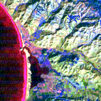
Reluctantly, we take leave of this attractive composite to examine several others made by various other band combinations. The first we will construct uses the same Bands 1, 2, and 3 but set with different color assignments. Thus, Band 1 = red, Band 3 = green, Band 2 = blue:
Features of special interest in the resulting image are, first, the intensification of the expression of sediment in the ocean, standing out sharply in red, and two, areas of more active vegetative growth (which would have lighter gray tones in the green band) appearing as distinct blues.
Let us now experiment further by using Bands 5, 6, and 7 in some combinations. The first casts 5 as blue, 6 as red, and 7 as green.
|
This combines the thermal band, sensitive to emitted radiation, (with its lower resolution 120 m. pixels) with two infrared bands, 5 and 7 (with their 30 m. pixels). In this color composite generated with IDRISI, the thermal band image (check TM 6 again) dominates. In the IDRISI mapping, reds and blues greatly outweigh any greens contributed by light tones in Band 7. The reds represent the warmer surfaces, and the blues the cooler surfaces, as recorded in Band 6. Note that the blues extend over a broader fraction of the hill slopes than we might expect from the shadow effects seen in other bands. In other words, the bulk of the back slope areas receiving less direct sunlight return less thermal radiation. However, some areas of blue that lie on the sunlit fore slopes are covered by the uplands vegetation at **g** and the grasslands at **v,** which offset the direct heating effect through cooling by evapotranspiration. Other areas supporting vegetation (as at **y**), and also along streams have dark red tones, not because they are hotter but because their tonal expressions in 5 and 7 are darker (almost no blue or green inputs).
Both urban communities show several shades of red, with the street patterns showing through because of their sharper definition in bands 5 and 7. This is, in part, due to the “urban island” thermal effect, which is the tendency of populated areas to be warmer because of heat-absorbing materials (darker streets, tar-covered roofs, etc.), reduced surface areas with vegetation, and heat emitted from furnaces, air-conditioners, and other human activities. Fully perceptible is the thermal plume emanating from the power plant (**t**), but the ocean sediments introduce no noticeable effect.
Some areas we see as green in the composite include the beach bar and several of the extraction pits (**u**). These surfaces reflect highly in most bands, hence, their light tones in Bands 5 and 7 combine the blues and greens assigned to these bands whereas their darkness in Band 6 (reflective materials are cooler) leaves red out.
|
Again, blues and reds are the prevailing colors, whereas greens are subordinate. The blues correlate closely with vegetation, which stands out in sharp contrast to most areas that either lack this cover or now support dormant grasses, etc. (note the active grasslands in lighter blue). The reds tie into three principal surface classes: the waves (note the bluish-purple tones within them, representing the Band 4 contribution); the sediments; and the towns, with the red streets speckled by blues from local vegetation. The greens show to some specific features that are relatively brighter in Band 7 and darker in Bands 1 and 4, including areas in the hills around Los Osos and some uncultivated areas (**m**) in valleys. Note scattered greens along the otherwise bright slopes.
In this last image, you no doubt noticed that there are some obvious similarities between this Band 7-4-1 combination (when the bands are stated this way, they refer to the color sequence BGR or blue-green-red; sometimes they are also written 741) and the Band 2-3-1 composite at the top of the page. But several distinctions occur: In the 2-3-1 version the breakers are white whereas they are reddish in the 7-4-1 version. This is because the breakers have about the same gray levels in Bands 1, 2, and 3 but are darker gray in 5 and almost black in 7. The blues in this last version are more intense and widespread since Band 4, which shows vegetation as very light tones, is rendered in blue and thus effectively emphasizes the locations of active growth. Also, note several areas of red in the 7-4-1 composite that are found within parts of the built-up or urban class; the color patterns are not the same in the 2-3-1 rendition, suggesting that equivalent areas are suppressed tonally in Band 7 and/or 4. If curious, retrace to page 1-3, which has all 7 bands together, to try to deduce whether it is one or the other or both.
